 Hope everyone had a good holiday. I have been really busy recently and the news has been slow. Really the only thing going on is MLB and the World Cup. I already broke down the World Cup uniforms. As a fan watching the games, I am rooting for Holland although Germany has been really fun to watch. I would like to see that match up in the finals. With baseball going on, I get bored writing about the different uniform match ups since their seems to be way to many options. For anyone who paid attention over the past weekend, all the teams wore those awful Stars and Stripes caps that don't match majority of the teams uniforms (more on that later in the week). Anyways, I came across this item that was posted on Uniwatch. It's the original article from when the Penguins team name was announced. And it didn't sound like too many people, fans, front office, the media, were really fond of it. But that's the name to board approved and that's history. Now you have one of the most popular and successful franchises in the NHL. I found one thing funny. They came up with a stock uniform before the team name was even announced. And they further more sounded happy they did so they could keep their distance from the team name, Penguins. To see the article, click here, and then it should take you to the page on a story about Bill Mazoroski. On the right there is a view finder and drag it to the left to the little circle on the left, above the picture of two guys in suits. That's the Pens logo and you can read it in larger area. Great article.
Showing posts with label NHL. Show all posts
Showing posts with label NHL. Show all posts
Tuesday, July 6, 2010
Pittsburgh Penguins: Team Name for the Birds
Hope everyone had a good holiday. I have been really busy recently and the news has been slow. Really the only thing going on is MLB and the World Cup. I already broke down the World Cup uniforms. As a fan watching the games, I am rooting for Holland although Germany has been really fun to watch. I would like to see that match up in the finals. With baseball going on, I get bored writing about the different uniform match ups since their seems to be way to many options. For anyone who paid attention over the past weekend, all the teams wore those awful Stars and Stripes caps that don't match majority of the teams uniforms (more on that later in the week). Anyways, I came across this item that was posted on Uniwatch. It's the original article from when the Penguins team name was announced. And it didn't sound like too many people, fans, front office, the media, were really fond of it. But that's the name to board approved and that's history. Now you have one of the most popular and successful franchises in the NHL. I found one thing funny. They came up with a stock uniform before the team name was even announced. And they further more sounded happy they did so they could keep their distance from the team name, Penguins. To see the article, click here, and then it should take you to the page on a story about Bill Mazoroski. On the right there is a view finder and drag it to the left to the little circle on the left, above the picture of two guys in suits. That's the Pens logo and you can read it in larger area. Great article. 

Thursday, June 17, 2010
Maple Leafs Fix Their Sweaters


Thursday, June 3, 2010
Buffalo Sabres...Will They or Won't They Change?

I got a NHL catalog in the mail and nothing ground breaking inside. I did notice the Sabres put their old logo on their 2010 Draft Day cap. Rumors have been flying around that the Sabres plan to go back to their original logo after the "buff-a-slug" logo was about as popular as AIDS in the 80's (Actually it was really popular but think like breast cancer awareness today. It was everywhere). But there are some good things that came out of these changes.

1. The Sabres paid attention to the fans. This is so important for owners and the front office people to realize. Yes, they make the decisions and they may refuse to do certain things. And they can do that if they want. But good teams and good owners pay attention to the fans and their wants. Bad owners and management have the "it's my team and I'll do what I want with it." They listened to their fans and they want the old logo. Kudos to them for that.
2. The Sabres re-found their identity. Some times teams think that a redesign will make over their franchise. Aesthetically they sometimes do that. More often they end up screwing around with the past and then come back to their roots. At least a lot of teams are appreciating the history and realize that is what the fans cheer for. They cheer for the soul of the team. Dad's want to take their kids to see the current Yankees in the same uniforms that they saw them as. And I'm sure this is what happened in Buffalo. The team has been around since the 70's. Those fans watched them, rooted for the, and loved them for who they were. But it means more when you do it in the same uniforms that their heroes did it in. Can you imagine the Red Sox having completely altering their look when they finally won the World Series? And how weird it was when the Diamondbacks or Marlins won it? Seriously, didn't you say to yourself "That doesn't look right?" I felt that way when my Pats finally won the Super Bowl. It was awesome and I loved it but I would have really like to have seen Pat Patriot celebrating more then the flying Elvis logo.


3. They learned what doesn't work. When teams do this they learn the hard way (think of the Pistons, Brewers, and Islanders). Actually it wasn't all bad. The first redesign wasn't that awful. The mean snorting buffalo head was kind of cool. I owned the red 3rd jersey for a while before I finally put it on EBay. The one thing it didn't do was represent the team name. It's Sabres not Buffalos or Bisons. Why they couldn't put a couple sabres behind it, I don't know (doesn't look too shabby). I get it, the city name is Buffalo. I wonder why they never tries the old colors with that logo. The change to red, black, and silver was radical and didn't quite go over but why not try that instead of developing the "buff-a-slug". Tie the new into the old.


Anyways, the Sabres are starting to look like the Sabres again. And that's all that matters. It doesn't look like they've completely committed (scroll down on the page) yet, but in time they will.
Tuesday, May 25, 2010
Stanley Cup Finals: Flyers vs. Blackhawks

 The absolute best championship series is about to begin, the Stanley Cup Playoffs. We have a pretty classic match up with the Blackhawks, an original six team versus the Flyers, an original expansion team. What a perfect combo to breakdown and pick a winner compared from a logo and uniforms perspective. I'm going to do something a little different and track the match ups as games and score them. First to 4 wins...This could go seven.
GAME 1: LOGOS
Two absolute classics. The Blackhawks have pretty much used the indian head as their logo since 1926, using this current version since 1964 interestingly enough longer than the Flyers have been a franchise. The Flyers have never strayed away from this flying "P" ever since they came into the league in 1967, along with the Penguins and Blues (and the Seals and North Stars who no longer are with us). I've never been as in love with the Blackhawks' logo for several reasons but most notably the weird grin on the guy's face and never really understood the yellow lines inside his head. But when it comes to logos, this is one of the all-time most iconic and I would possibly put it in the top 5 of all professional sports (maybe if I need to write something for an entire year I will do that. Hmmm, ranking all logos in the 4 major sports...that could be one hell of a project). But let it be noted the Flyers are no pansies in the logo fight. I'm going to score game one 4-2 but the Blackhawks scored an empty netter to seal it. Blackhawks lead 1-0
GAME 2: HOME UNIFORMS
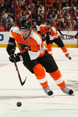
With the Flyers trailing 1-0 in the series, could they tie it up and make this a fight? The Blackhawks wear red home unis, the Flyers wear orange. Both teams look blazing bright when hosting an opponent. So what can we breakdown to give someone an advantage. Both teams wear black pants. The Blackhawks have some sock striping that looks nice. But when it comes down to it, I like the Flyers home set better. To me the Blackhawks' red set has always seemed odd to me for one main reason: the Blackhawks logo with the different colored feathers just doesn't lay well on red. The colors clash too much with the red and make it look messy. The Flyers on the other hand went old school, went two toned with orange and white (they do have black on the sleeves but it's on the sleeve cuffs and blends into the gloves so it's barely noticeable) and the black Flyers' logo stands out so much nicer on the orange. And some people hate it, some love it. I love the white name plate placed on the back. It's so simple to do but yet so original. Flyers tie this up with a 3-2 victory. SERIES TIED 1-1


GAME 3: AWAY UNIFORMS
Well where the Flyers have the advantage in the home uni, they fall way short in the away. The Blackhawks white uniform is one of the best if not the best in the NHL. The logo looks so great on the white and the beautiful striping on the sleeves and hemline are gorgeous (am I flirting with a jersey?). The Flyers on the other hand have average white jerseys and the Reebok re-design makes them kind of look like how WNBA and college women's basketball players wear their jerseys. Puke! (not about Diana Turasi or the Mercury uniforms but the Lifelock soccer like sponsorship deal is sad. But hey that league needs all the money they can get. We'll deal with them later...maybe never.) Blackhawks win huge 5-0. Blackhawks lead 2-1


GAME 4: ALTERNATE UNIFORMS
Let's make this simple: Blackhawks. Flyers. Not even close. Blackhawks win big again 6-1. Blackhawks lead 3-1.


GAME 5: ALTERNATE LOGOS
Well, this is a hard one to judge. Mostly because the Blackhawks have one and the Flyers don't. They did try this but they pretty much have scrapped using it and when it's almost the exact same thing as your actual logo, does it even count? So in my book, when you have one alternate logo that a team has been using literally before the other team was even created and stuck with it after 44 years you have to give them the edge. But dammit you have respect a team that didn't give in the the merchandising machine and create an alternate just for the hell of it. With that, Blackhawks win 3-2. Blackhawks win series 4-1.

So my Stanley Cup Finals prediction is the Blackhawks win in 5. Let's see how it plays out in real life.
Tuesday, May 11, 2010
Winnipeg Jets or Winnipeg Coyotes?
 Big rumors being thrown around about the possibility of the return of the Winnipeg Jets. What makes more sense than putting a team in a city that is rich in hockey history, loves the game, and isn't in the desert. There are some interesting developments that could happen. Since the Coyotes used to be the Jets, then it makes sense there shouldn't be a huge problem making the switch back to the old nickname. However consider this, the NHL and the team has a whole warehouse with Coyotes gear with the howling logo stashed away somewhere. Could it be possible that the keep the Coyotes name? Makes sense. There are coyotes in Canada so changing the team name wouldn't be a slam dunk case. The league could then use the stuff that doesn't say Phoenix on it and just re-market it as Winnipeg. This could happen so the league doesn't have to clearance a boatload of merchandise. What is a shame is just when the Coyotes got it together and put a decent logo (after having a turd originally) they might have to drop it. I am all for the return of the Jets, but you just may have the Winnipeg Coyotes next season. Of course someone might step up and keep the team in Phoenix. But don't count on it. This team is hemorrhaging money. Now if we can just get back the Nordiques and Whalers back the NHL will be set. One more funny thought, How often does Vintage merchandise from a defunct team become current again?

Subscribe to:
Posts (Atom)