 Well the Jazz and Magic unveiled their new logos. Both are okay; upgrades for both. I wouldn't call it a total win though. Both teams upgraded their looks. Last month I ranked all the NBA logo's. With these changes really am not inclined to improve either's rankings. I had the Jazz #28 and the Magic at #10. You would think that the Jazz bringing back the old music note, they would surely move up. But let me breakdown the changes.
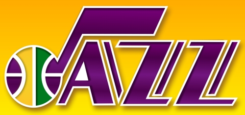
Utah Jazz
I love the music note logo. The Jazz brought back the look but not fully. The primary color is navy blue instead of the traditional purple. I am in the camp that purple is a fine color when used properly. But the NBA has enough team using purple: Lakers, Hornets, Suns, and Kings. So a change to purple wasn't necessary. It keeps them seperated a bit. They added the yellow and green which was apart of the original color scheme and they fixed the basketball so it now has proper striping. So why is this not a total win? Because this is their secondary logo. The Jazz kept their old primary "snow mountains" logo and just recolored it. So now they have to completely separate logos that don't match each other. I have no idea which one they plan to use the most and they didn't release their new uniforms. The music note logo is supposed to decorate the Jazz home floor. I'm guesing they are going to use the new music note more , but who knows? Stupid.
Orlando Magic
 The Magic basically matched thier logo to their current jersey font. It's a more streamlined look and the reduced the number of stars being used. I like the new logo but not in love with it. They kept the swooshy magic basketball which I like. As I stated before, I'm not sure how else you illustrate magic without being silly. I will say the new logo lost a little character. At least everything matches now. That's always important and it's something the Jazz completely ignored.