Friday, August 6, 2010

Who Are We? Not the Devil Rays, for sure...

The Tampa Bay Rays. It's been 2 years now since the dropped the "devil" from their names and decided to be known as just the Rays. Since then, they seem a little confused on finding exactly how they want to be identified. I get the play of the name. Florida has sun and the sun makes rays (a play I find a little strange for a team that plays indoors in what most consider the worst baseball stadium in MLB. The get no rays in there). I will give them credit. they are trying to make it work in Tampa. Why Tampa isn't behind them fully, I'll never know. As a Pirates fan, I would kill to get that team in the Black and Gold (Some sports writer wrote an article about that a couple months ago that MLB should fire everyone in the Pirates organization an then move the Rays to Pittsburgh and let that team play as the Pirates in the best ballpark in MLB. It begs for the big stage). Dreaming. Dreaming. And I'm back. Anyways, the rays went from this to their current version. They promptly made a World Series appearance. I'm of the thinking that the green color scheme they had before was a very good look. Also because green is soooo underplayed in MLB. Literally the Oakland A's are the only other team that uses it. So let's breakdown the Rays uniform combos:
1. Home white
2. Road Gray
3. Blue Alternate
4. Baby Blue Alternate

First thing I've noticed is they are totally committed to being the Rays. It's on all 4 of the jerseys. Where they seem confused it what to do with their alternate logos. Are they the sun rays or the "devil" rays? The fish ray logo is a jersey sleeve patch on the home and road uniforms. The sun ray logo is apart of the Rays logo and is in the outfield on their "grass" turf. So which are you, Rays? And they have a nice TB logo, why not use it more? So here are my quick fixes.

1. Choose an alt logo and stick with it. Fish, Sun, or the TB.
2. Come up with a Tampa Bay full logo to use on the road jersey.
3. One of the alternates, I'd say the baby blue, put the one of the alt logos, TB, sun, or ray, on the left chest.
4. Figure out where to better utilize the use of gold. They have it in there. It could be used more effectively.
5. Move the team to Pittsburgh and become the Pirates. No, actually I'd like to see one of their alt logos used on a cap to break up the monotony of the TB hat. It's nice but it's about finding more choices to sell.

The Rays need to get it together because their time is now. They have the star players. They've been to the World Series. They are arguably better than the Yankees and the Red Sox who are bigger payroll teams. The Rays are in the spotlight and they need to shine with their look.

Wednesday, August 4, 2010

Who Are We? The Blue Jays?

There are some things that don't make sense with baseball uniforms when it comes to colors in team names. The White Sox don't wear white socks. The Red Sox don't wear red socks. But the Blue Jays seemed confused and I can't forgive them for their mistake. I have no problems with them adding black. In fact it's actually more realistic to what a blue jay looks like. But here in lies the problem; the breadown of the uniform combos:
1. Home white 2. Road gray 3. Black Alternate
4. Throwback Alternate

See the dominating tone. It's black. Except for the throwback alternate. But then they go and over do it with the blue. Baby blue is the new black. Seems like evey team is trying to throw it in somewhere. What the big shame is is there was nothing wrong with their previous 2 uniforms( 1992 WS, Clemens era. This logo was kind of stupid). Personally, I hate the overdone beveling on the lettering. They had a classic font. That's what the Blue Jays look like to me. So, here are my quick fixes:

1. Flip the primary colors. More blue less black. Hell, even change black to navy blue.
2. Drop the beveling from the letters.
3. Change the throw back blue to the version they wore in 1992.
4. Bring back the blue and white hat. It could be their niche.
5. Embrace the Canadian leaf again. As the only Canadian team left in MLB, own it.

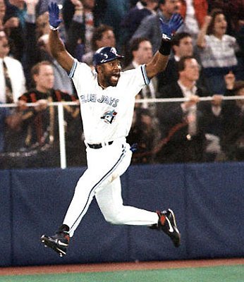
Overall, I really don't like the new blue jay face with the "J" logo. The old school blue jay with the little red maple leaf, and the stripe style font need to come back. Until the Blue Jays embrace who they are, they are stink-o looking. My feelings on them, they are going to be a while before they can pass the Yanks, Red Sox, and Rays for a World Series. At least come up with a look that will sell gear. As of now, I wouldn't buy any of their new stuff. Which is sad, because I would love to have some their stuff. The Joe Carter walk off home run was one of my favorite baseball memories. I could get behind that. Right now, not so much...


Sunday, August 1, 2010

It's Been A While...MLB Teams Who Can't Find Themselves.

Yes, I know. It has been a while. Let me just say it's not that I'm too busy or don't want to work on this blog. It's actually the opposite. I am very close to getting a new computer with all the Adobe software I can handle. And I really want to get it so I can edit and show my thoughts, just not type them out and let anyone reading guess what I am talking about. My passion is still there, I just got frustrated with my product. I want it to be better, a lot better. So since I'm close to getting what I want, I'm ready to dive back in. So, with no further delay, here is my new project. I have been looking around at what teams are doing, and what they have been wearing. I've been watching baseball and soccer all summer. While watching some baseball, I have a few teams in mind that just don't seem to know what to do with themselves. Their looks are confusing, and just don't make any sense. And as I looked there are teams like this in all the upper echelons of pro sports in America. I'm going to start with the MLB teams since it's their season right now.

The first team I've picked to do this is the Washington Nationals. The Nats, well they are all over the place. First thing, lets breakdown all their current combos (note these are from the MLB galleries so you might have to scroll through to see what I'm talking about):
1. Home whites
2. Road grays
3. Red Alt
4. Blue DC Alt

When you look at all those combos, there are so many mismatches in identities it's scary. The home whites have the classic curly W logo, with a modern looking font on the jerseys. The road grays and red alts look good from the front and almost completely match for what would be a great look. Then you see the backs and they use the modern font for the numbers. All 3 have the the modern, solid colored DC logo sleeve patch. Then lastly the the blue DC alt. Not much to describe for those besides awful. Why they want to throw a Stars and Stripes theme into the logo is quite the conundrum. Especially since they use the regular DC logo on their other jersey sleeves. One a side note, the blue jersey is the only one that actually looked respectable with those MLB American Pride hats they made every team wear including Toronto, but wisely made them in Canada's colors.

The Nationals don't seem to know whether they want a modern look or a classic look. Or if they want to be identified as the team name, city, or city nickname. Here are my quick fixes, without a major overhaul to all.

1. Use the solid DC logo on the home red cap paired with the modern number font.
2. Keep the road grays with the navy hat and use the curly W logo. Drop the modern fonts and use a plain block number scheme.
3. Burn the Stars and Stripes DC crap or just put the regular DC logo instead.
4. Drop Nationals name all together and just rename them the Washington Strasburgs or drop Washington and call them the Strasburg Nationals. Sounds like a city right?
5. Move back to Montreal and re-become the Expos. At least they looked cool.

The Nationals have a lot of potential with their uniforms but they've just thrown too many elements together. If you are going to have the biggest name in baseball on your team, fix it so you sell even more gear.

Tuesday, July 6, 2010

Pittsburgh Penguins: Team Name for the Birds

Hope everyone had a good holiday. I have been really busy recently and the news has been slow. Really the only thing going on is MLB and the World Cup. I already broke down the World Cup uniforms. As a fan watching the games, I am rooting for Holland although Germany has been really fun to watch. I would like to see that match up in the finals. With baseball going on, I get bored writing about the different uniform match ups since their seems to be way to many options. For anyone who paid attention over the past weekend, all the teams wore those awful Stars and Stripes caps that don't match majority of the teams uniforms (more on that later in the week). Anyways, I came across this item that was posted on Uniwatch. It's the original article from when the Penguins team name was announced. And it didn't sound like too many people, fans, front office, the media, were really fond of it. But that's the name to board approved and that's history. Now you have one of the most popular and successful franchises in the NHL. I found one thing funny. They came up with a stock uniform before the team name was even announced. And they further more sounded happy they did so they could keep their distance from the team name, Penguins. To see the article, click here, and then it should take you to the page on a story about Bill Mazoroski. On the right there is a view finder and drag it to the left to the little circle on the left, above the picture of two guys in suits. That's the Pens logo and you can read it in larger area. Great article.  

Tuesday, June 29, 2010

Weekend Round Up: MLB Throwbacks, Timbers Revise Logo

On Saturday, I did a recap of the two new MLS teams for next year. I link to some reports and a video of the Portland fans booing and hating their new mark. Well they've already revised the new logo so here is the new, new logo. Changes they made: #1 They took away the yellow and green shadowing on the ax, going with just a plain, white ax. #2 They removed the line slashes that were pointing into the word mark. #3 They toned down the thickness of the outer yellow outline. As I stated before, I thought the new logo was fine and I don't feel any differently about this updated version. I guess after looking at it, the old, new version didn't need all that detail on the ax. The plain ax is still bold looking and gets the point across. But really I could go either way. I think their fans were being too picky but when they are drawing 3 times as many people as the Triple A baseball team, they care a lot (the Timbers draw 15 to 20 thousand people to their matches pre MLS).

The Brewers and Mariners broke out the old duds for a game in their weekend Interleague series. Now this isn't new for the Brewers who have a throwback alternate already, but the Mariners wore a version they don't go to very often. And really, this is another team that after years of using the "S" compass logo, might really need to look at going back to this old school beauty. Or at least incorporate it somehow. I see the trend of a lot of teams finally realizing their old look. I would like the Mariners to take that step.

The O's and Nats put on the throwbacks as well. The Nationals had to of course use the Senators, which is weird they are allowed to use them since the Texas Rangers were the result of the Washington franchise moving. The Senators uniforms are kind of boring but the work. I have to say that the Orioles look great. That old template looks fantastic and I love the cartoon bird. I don't know why the O's insist on using the actual oriole bird as their primary cap logo. An oriole is such a pacifistic bird so why not cartoon it up? I love the smiling bird on the cap and combine that with the O's cap, that the combo they should have. And don't get me wrong, I like the current Orioles look. But that cartoon bird is great. Which is strange because I hate the Indians Chief Wahoo guy on their cap.

Monday, June 28, 2010

A's-Buccos Break Out the 70's


The Athletics and the Pirates broke out into solid color 70's uniforms on Saturday. Both looked so awful, they looked fantastic. The A's were in all gold and the Bucs in all Black (link to photo gallery). After seeing the A's on Saturday in the gold and then they wore those stupid black uniforms on Sunday, I wish they would go with an alternate gold with the A's logo. The Bucs should think about the same thing. Although I don't care about their black alternate because they have black in their color scheme. I'm not a huge fan of the black alternates, I do kind of like the white outline. And I don't get why they kept the sleeveless pinstripe alternate. If they want to go pinstriped, go with this. Anyways, back to Saturday's game. The teams looked nice but I wish they both would have went with different colors for either the jersey or pants. The A's could have went with green pants, gold jersey and the Bucs black jersey, gold pants. It was a little too much solid colors. And I couldn't find a decent picture but I couldn't tell if either team was wearing real stirrups or if they were made into the socks. And the A's starting pitcher Cahill had the fake stripe socks on. Come on this ain't softball. It looked awful

Saturday, June 26, 2010

Two New MLS Teams For Next Year

Starting in 2011, two new expansion teams will be joining the MLS. Those two teams have unveiled their logos. The Vancouver Whitecaps FC have been around in some form for over 30 years. The team name has been the pro soccer team moniker by deflate for 6 teams in 4 men's leagues and is also the current women's league name. The current Whitecaps of the USSF will move up to North America's highest pro league with the logo pictured left. The new logo is a welcomed change from their current logo, which is very cartoonish. It's not bad, very sleek but not much character. I like the baby blue and I don't know if the meant to but the almost have a interlocking "VW" formed on the bottom blue. If they did mean it I wonder why they didn't complete the formation of it?
Now the other team scheduled to make their debut, will move up from the USL to the MLS. The Portland Timbers unveiled their logo with only one minor problem: the fans hate it. Well not all of them but it seems a lot of people preferred the old one. I personally like it. I also like the old one. I guess that's the conundrum. Did it need to be changed? Some are calling the new one too cartoonish, unfinished looking, too busy, and many other negative things. It doesn't start well for a franchise when after it's unveiled at a public video display, the crowd chants vulgarities and boos. Watch this video on YouTube. At first they cheer and awkwardly applause then it's like it hits the crowd what they are looking at and then turn on it. Relax Portland. It's not that bad.