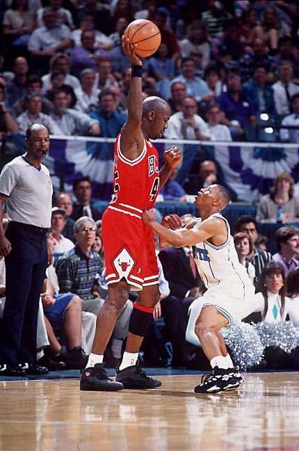
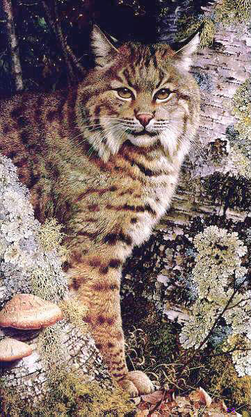
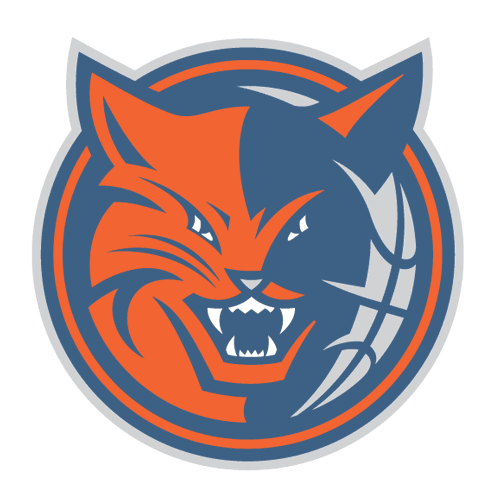
Let's see how these play out.
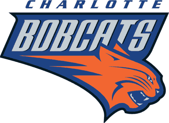 I hate rating this logo so low but it was something that shouldn't have happened. Charlotte had their team with a popular logo that made Zo, Mugsy and Grand Mama household names in the 90's. But in 2004, Charlotte was awarded an expansion team and the team (some say the owner) chose this logo. My main problem with this logo is the bobcat is non descript and bland. Bobcats have a very distinct fur pattern and especially unusual face patterns. The logo shows none of that. To me this is just a cat. Could be any cat. Bobcats have big ears as well. To me if you're going to pick a bobcat for a logo, then make it a bobcat, not a housecat.