
Showing posts with label Golden State Warriors. Show all posts
Showing posts with label Golden State Warriors. Show all posts
Thursday, June 17, 2010
The Warriors Don't Look Terrible Anymore!
Wednesday, May 19, 2010
The Warriors are ready for a rebranding!

Let's see how these play out.
Saturday, April 24, 2010
Ranking NBA Primary Logos:#27 Warriors
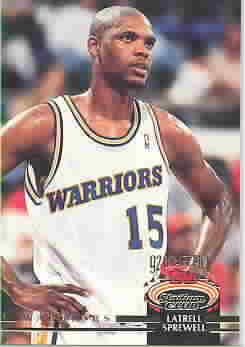
 The Golden State Warriors switched to this logo in 1997 after using this oldie but goodie for a long time. The team was moving on from having gone from good times when Chris Mullin and Tim Hardaway roamed the floor to when Latrell Sprewell and Chris Webber ruled the floor and put the team behind in rebuilding. Of Course Spree had his famous choking coach incident (which I thought it was funny they went to a guy choking a lightning bolt for a logo) and Webber was too expensive for what he was and they traded him in his 2nd year (long story). So this is the look they came up with. I for one never liked this logo. I'm not sure why they chose Robocop to represent them but that is what they chose. They added orange to the team color scheme as well as darkened the blue and gold from their original colors. This is another team that might change things up soon as Stephon Curry grows. His jersey could be a top seller so they will need a change to help move Warriors merchandise. They have never been a huge seller. I remember seeing Hardaway, Mullin, and Webber jerseys when I was growing up but I haven't seen a good seller from them in a while. Curry is going to change their image and the team should follow suit.
WAYS 2 IMPROVE
Personally I would drop the orange and go back to the royal blue and gold look. I actually think they have something with their 3rd logo. They could be able to build from that. It has a prominent presence on their website so this may be the way they are leaning. They may go in another direction completely. Either way RoboCop has to be dropped. It's too much, does not reflect well because you don't really get what he suppose to be without seeing the Warriors name attached to it. Plus I think it looks like he is doing something with that certain male part.
Subscribe to:
Posts (Atom)