NEWS FLASH! For those of you residing in America, there is a sports out there that is more popular globally than in the USA. It's called soccer or
futbol. And there is an entire league of these "soccer" teams that play here in the States. It's called the
MLS and if you've never been to a game, I recommend going sometime. I went to a Columbus Crew game a few years back and had a blast. It's really great to watch in a facility that is made for soccer. And I am way excited for the World Cup to begin. Anyways, that brings me to an expansion team that started in the
MLS this year, the Philadelphia Union. I don't care for Philly that much being from around Pittsburgh all my life, but I have to say I love this logo. I read the break down of it and it is packed with historical meanings. I quote from the ultimate source,
Wikipedia: "
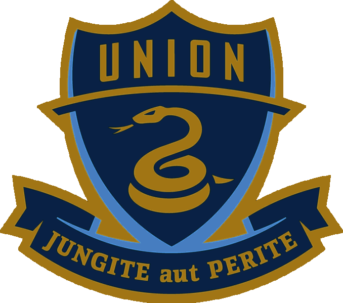
The Union's colors are navy blue and gold, representing the primary colors of the Continental Army's uniforms during the American Revolutionary War. The team's primary logo is circular, symbolizing unity. Its thirteen gold stars represent the original Thirteen Colonies, while the shield's contour derives from the Philadelphia coat of arms. The rattlesnake pays homage to a political cartoon by Benjamin Franklin that was featured in the 1754 Pennsylvania Gazette. The rattlesnake eventually became a national symbol during the American Revolution, representing the danger of disunity, and was featured on the Gadsden flag.The light blue in the middle of the badge is a tribute to the Sons of Ben, and is further derived from the civic flag of Philadelphia. The team's secondary logo is a simplified version of the above design that consists of the blue shield with the rattlesnake, augmented with a gold border and a ribbon bearing the team's official motto: "jungite aut perite", a Latin translation of the phrase "join or die", which was also used in the 1754 Benjamin Franklin political cartoon mentioned above. The home jersey is midnight blue, with a gold strip down the center with light blue piping in the color of the Philadelphia flag. The away kit is the reverse of the home kit – predominantly "natural khaki" with a midnight blue panel and blue piping
Wow, now that is a logo. I couldn't believe all the stuff that is packed into a simple, yet beautiful, logo. Stunning. I know the Union will never surpass the Eagles,
Phillies, 76ers, or
Flyers in popularity but the Union represents the city better than any of them. Very cool stuff. (Side note: One thing I really like about the
MLS, they aren't teams but listed as clubs. Makes them sound special. Like at your office you can put together a "team" to brainstorm or whatever. But a club? That's a privileged.)
No comments:
Post a Comment