Monday, August 9, 2010
NFL Primary Logo Rankings: #32 Browns
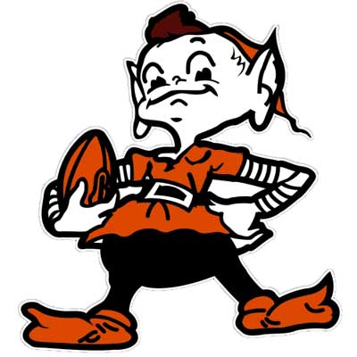
The poor city of Cleveland. I hate ranking them last after what they have been through lately ("I'm taking my talents to South Beach"). But, with that said I have to put them last in the logo ranking because well they don't really have one. That is what they use. Their helmet. Really? That's all you got? It's not like they don't have options. They have a their dog face logo. They tried a "B" logo with striping (under the crazy dog logo). Both okay but I can see why they didn't quite stick. Well, I guess I shouldn't say that. The dog face is one they currently sort of use but it's really not that good. Anyways, the Browns have pretty much just used the helmet as their logo for 25 years. The sad part is they could be top 5 if not #1. They used to have a "brownie" elf guy logo that was just fantastic. Does that logo any way say tough, macho, dog pound, intimidating, or any other adjective a football team wants to say. No, but it is sooooooo awesome. This could be the Boston Celtics logo of the NFL. And you know what, the Browns really haven't won anything since they ditched the elf so it's time to bring back that Cleveland Browns magic.
Uniforms for 2010: Home, Road, Throwback
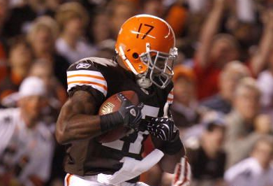
Their also seems to be the possibility for brown on brown, white on white, and they have worn orange pants before but I think the Mangenius wanted to go with the brown pants. I really like the Browns on-field look. They are a top 5. It's original, iconic, and just plain works. Literally the Browns are the only team that openly and passionately use the color brown. More power to them. But no logo means you get ranked last when it comes to a logo ranking list.
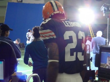
Not to rub salt in a wound but remember this? Jerk...
Subscribe to:
Post Comments (Atom)
Shocking that the Browns come in last. Just an awful look with nothing to it. Glad the rankings are back. I enjoyed the NBA ones
ReplyDelete