I always found this team name a little funny because nothing says swash buckling quite like the city of Cleveland, but hey
a lot of team nicknames don't make any sense. Anyhow, the Cavaliers wizened up and came up with something that showed the full name of the team. Before then I would call them pioneers for using
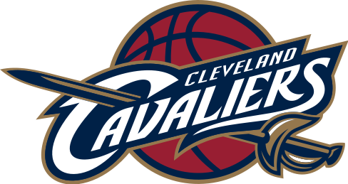
a nickname of a nickname as their logo. Seriously, I know most people refer to them as the
Cavs but no need to give into peer pressure and make it your logo. If other teams did this we'd have the C's, Clips, and
Grizz logos (a note to
ATL,
PHX, Sens, and Bolts, wake up and put your damn team name or city on your freaking unis). Back to the topic on hand, the Cavaliers put together a good looking logo with a crazy but not too crazy font that translates well to
their jerseys. I like the color scheme but that's where I find a problem with this team and logo.
WAYS 2 IMPROVE
Pick a damn color scheme and use it. The
Cavs have gone through four different combinations in their history and I'll rank them: #
4 black-baby blue-orange; #3 royal blue-orange; #2 current maroon-navy-gold; #1 maroon-gold. The #1 was their original colors and should be their colors. The
Cavs, Hawks, and Rockets all moved away from the red-yellow color scheme probably because McDonald's and
Ronald McDonald became associated with those colors. But screw that, it looks nice. I linked before that showed some leaked logos that looks like the
Cavs may
change the gold to a yellow. Nice step in the right direction. Hope it happens. Just in time to sell new
merch if they re-sign
Lebron.
No comments:
Post a Comment