WAYS 2 IMPROVE
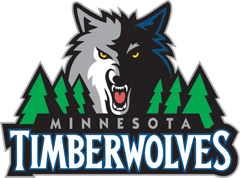
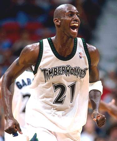
I don't know know why they need the trees. I get it that wolves live in the woods but they're not needed. The font is better but I wouldn't consider it great. I don't know what it is but quirky fonts on jerseys just aren't that great but on logos they're fine. I guess I want them to change one to fix the other. At least the font change got rid of this turd. The old T-Wolves logo was another one that at the time needed changed but looking back, it was a keeper. But i'm not sure with this team. The old logo was never associated with any real winning however the mean wolf brings up memories of KG and runs to the Western Conference Finals. Get rid of the black. Teams just throw black into their colors sometimes and it's not needed. Plus it's lazy.
No comments:
Post a Comment