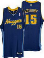
 The Nuggets have one of the wackiest logo history's of any professional franchise. First they had the palest miner ever in a b-ball uniform. Seriously where was this guy mining his whole life, in a cave? And he looks like he mining for cocaine and found it. Then the gay pride tetris era. So it's natural they gravitated to this modest design back in 1992. Since then they change the color scheme to the hot new "black", powder blue (seems like everyone is doing this, like belly button rings and tribal tattoos). To me this is like the girl you date after two messed up relationships. Safe and boring, but better than what you used to have and it's pretty. Maybe that's a better analogy. Ever meet a hot girl who has no personality? That's what this logo is. Pretty to look at but doesn't say much.
WAYS 2 IMPROVE
I personally like the old Nuggets font a lot better. At least is had some original character. I also like to script "Nuggets" they use on their third jersey. They could maybe come up with something there. Big problem is that this logo doesn't convey anything. I guess since Denver is pretty, then a pretty logo makes some sense. They need some character though. Like maybe a gold nugget that has basketball striping (I know it's a reach). I don't know. This is a tough one.
No comments:
Post a Comment