 The absolute best championship series is about to begin, the Stanley Cup Playoffs. We have a pretty classic match up with the Blackhawks, an original six team versus the Flyers, an original expansion team. What a perfect combo to breakdown and pick a winner compared from a logo and uniforms perspective. I'm going to do something a little different and track the match ups as games and score them. First to 4 wins...This could go seven.
GAME 1: LOGOS
Two absolute classics. The Blackhawks have pretty much used the indian head as their logo since 1926, using this current version since 1964 interestingly enough longer than the Flyers have been a franchise. The Flyers have never strayed away from this flying "P" ever since they came into the league in 1967, along with the Penguins and Blues (and the Seals and North Stars who no longer are with us). I've never been as in love with the Blackhawks' logo for several reasons but most notably the weird grin on the guy's face and never really understood the yellow lines inside his head. But when it comes to logos, this is one of the all-time most iconic and I would possibly put it in the top 5 of all professional sports (maybe if I need to write something for an entire year I will do that. Hmmm, ranking all logos in the 4 major sports...that could be one hell of a project). But let it be noted the Flyers are no pansies in the logo fight. I'm going to score game one 4-2 but the Blackhawks scored an empty netter to seal it. Blackhawks lead 1-0
GAME 2: HOME UNIFORMS
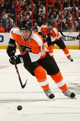
With the Flyers trailing 1-0 in the series, could they tie it up and make this a fight? The Blackhawks wear red home unis, the Flyers wear orange. Both teams look blazing bright when hosting an opponent. So what can we breakdown to give someone an advantage. Both teams wear black pants. The Blackhawks have some sock striping that looks nice. But when it comes down to it, I like the Flyers home set better. To me the Blackhawks' red set has always seemed odd to me for one main reason: the Blackhawks logo with the different colored feathers just doesn't lay well on red. The colors clash too much with the red and make it look messy. The Flyers on the other hand went old school, went two toned with orange and white (they do have black on the sleeves but it's on the sleeve cuffs and blends into the gloves so it's barely noticeable) and the black Flyers' logo stands out so much nicer on the orange. And some people hate it, some love it. I love the white name plate placed on the back. It's so simple to do but yet so original. Flyers tie this up with a 3-2 victory. SERIES TIED 1-1
GAME 3: AWAY UNIFORMS
Well where the Flyers have the advantage in the home uni, they fall way short in the away. The Blackhawks white uniform is one of the best if not the best in the NHL. The logo looks so great on the white and the beautiful striping on the sleeves and hemline are gorgeous (am I flirting with a jersey?). The Flyers on the other hand have average white jerseys and the Reebok re-design makes them kind of look like how WNBA and college women's basketball players wear their jerseys. Puke! (not about Diana Turasi or the Mercury uniforms but the Lifelock soccer like sponsorship deal is sad. But hey that league needs all the money they can get. We'll deal with them later...maybe never.) Blackhawks win huge 5-0. Blackhawks lead 2-1
GAME 4: ALTERNATE UNIFORMS
Let's make this simple: Blackhawks. Flyers. Not even close. Blackhawks win big again 6-1. Blackhawks lead 3-1.
GAME 5: ALTERNATE LOGOS
Well, this is a hard one to judge. Mostly because the Blackhawks have one and the Flyers don't. They did try this but they pretty much have scrapped using it and when it's almost the exact same thing as your actual logo, does it even count? So in my book, when you have one alternate logo that a team has been using literally before the other team was even created and stuck with it after 44 years you have to give them the edge. But dammit you have respect a team that didn't give in the the merchandising machine and create an alternate just for the hell of it. With that, Blackhawks win 3-2. Blackhawks win series 4-1.
So my Stanley Cup Finals prediction is the Blackhawks win in 5. Let's see how it plays out in real life.
No comments:
Post a Comment